
Tui Digital Article
When a High-Ticket eCommerce Website Tells You Very Little
A case study-style look at why premium eCommerce mentorship and done-with-you programme websites need clearer offers, pricing context, timelines, and buyer information.
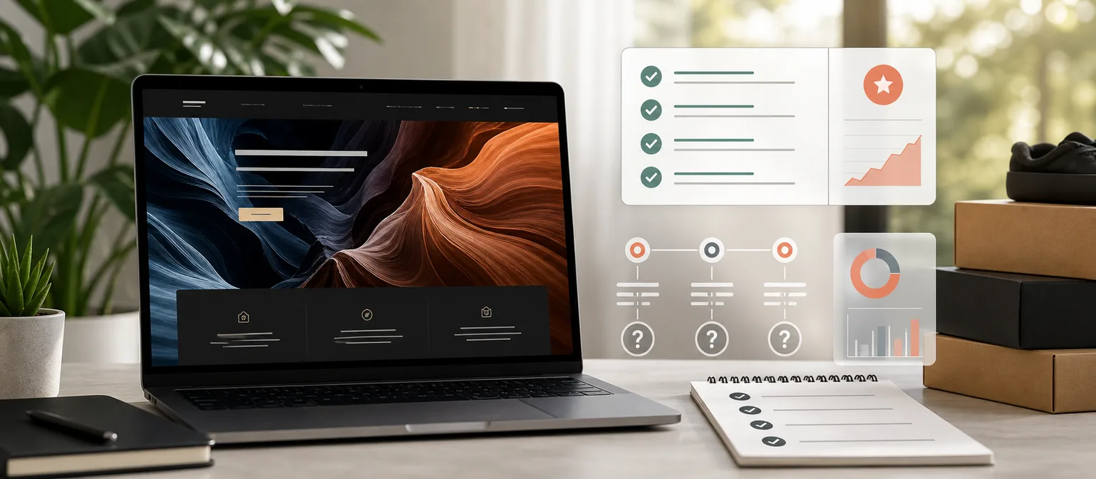
If you have ever landed on a website selling an eCommerce mentorship, coaching offer, or “done-with-you” business programme, you have probably had the same experience I did.
The homepage looks polished. There are impressive revenue numbers, success stories, professional videos, and promises of helping you build a successful online business.
But after spending several minutes on the site, you are still left wondering:
What exactly are they selling?
That is a surprisingly common problem.
It is also a useful lesson for any business selling a premium service online. A website can look expensive, feel exciting, and still leave the buyer without the practical information they need to trust the offer.
If your own site brings in traffic but not enough enquiries, this is exactly the kind of problem we look for in website design and landing page audits.
A website that sells the dream
Many high-ticket eCommerce coaching companies do not sell a simple product. They sell transformation.
Instead of explaining their methodology in detail, they focus on outcomes:
- Build a profitable eCommerce brand
- Scale to six or seven figures
- Quit your job
- Learn from experts
- Get ongoing support
None of those promises are inherently wrong.
The issue is that they are often presented without enough context to help a potential customer understand exactly what they are buying.
There is a difference between making an offer exciting and making an offer vague.
Excitement can get attention. Clarity builds confidence.
What is missing?
As someone who works in digital marketing and web development, I find myself looking for straightforward answers.
Questions like:
- What does the onboarding process actually look like?
- What work does the company do?
- What work is the client’s responsibility?
- How long does the programme typically take?
- What happens after the store launches?
- What tools and systems are included?
- What ongoing costs should a client expect?
- What does support look like after the first sale?
These are the questions most buyers need answered before making a significant investment.
Instead, many websites rely heavily on testimonials, motivational messaging, and booking a sales call.
Testimonials are useful. A call can be useful. But they should not be carrying the entire explanation of the offer.
The website experience matters
One thing that often stands out is the website itself.
The pages contain large videos, animations, tracking scripts, pop-ups, and interactive elements. These can create a polished first impression, but they can also make the site feel heavier than necessary.
A fast website is not just about performance scores.
It is about reducing friction.
When someone is considering spending thousands of dollars, they should not have to wait for pages to load or search through multiple sections to understand the offer.
Speed matters, but so does structure.
Can the buyer immediately understand what the programme includes? Can they find the next step? Can they compare the promise against the practical work involved?
If the answer is no, the website is creating doubt at the exact moment it should be reducing it.
This is similar to what happens when paid traffic reaches a weak landing page. The clicks arrive, but the page does not answer enough buyer questions to convert. We cover that pattern in our guide on Google Ads clicks with no enquiries.
Why do companies do this?
It is largely a sales strategy.
Rather than answering every question online, the website is designed to generate a consultation.
During the sales call, the company can:
- Understand the prospect
- Handle objections
- Explain the programme
- Build trust
- Close the sale
From a marketing perspective, this approach can work.
From a customer’s perspective, it can feel like important information is being withheld until after they have committed time to a conversation.
That is the trade-off.
Some businesses deliberately keep the website broad so the sales team can shape the message in the call. But when the website is too vague, qualified buyers may leave before they ever book.
The best premium-service websites do not replace the sales conversation. They improve it.
They let the buyer arrive informed, warmer, and with better questions.
What a transparent website should include
If you are selling a premium service, clarity builds confidence.
A strong website should clearly explain:
- Exactly what is included
- What happens week by week or stage by stage
- Who performs each task
- Expected timelines
- Required budget beyond the programme fee
- Realistic success expectations
- Common reasons clients fail
- What support continues after launch
- What kind of client is a poor fit
That last point matters.
Premium offers should not try to sound right for everyone. A good-fit section and a not-good-fit section can build more trust than another vague promise about results.
Ironically, being honest about limitations often increases confidence.
It shows the buyer that the business understands the work, not just the outcome.
Transparency does not mean giving away the whole process
Some businesses avoid detail because they worry competitors will copy them or prospects will try to do everything themselves.
That fear is understandable, but it is usually overestimated.
You do not need to publish every internal template, script, supplier list, or private system.
You do need to explain enough for the buyer to understand:
- What they are buying
- What the journey looks like
- What the risks are
- What their role is
- What happens if things do not go perfectly
That level of clarity does not weaken the sale. It filters the sale.
It helps serious buyers move forward and helps poor-fit buyers opt out earlier.
For many businesses, that is healthier than filling the calendar with calls from people who were never going to be a good fit.
Questions every buyer should ask
Before investing in any high-ticket eCommerce programme, ask:
- What work will I personally need to complete?
- What work will your team complete?
- How much additional money should I budget for advertising, software, inventory, and operations?
- Can I speak with current clients, not just selected testimonials?
- What happens if my first product does not work?
- Is there a clear roadmap before I sign?
- What support do I get after launch?
- What would make me a bad fit for this programme?
If those questions cannot be answered clearly, it is worth slowing down.
That does not mean the business is bad. It means you need more information before making a decision.
What this means for your own website
This is not only relevant to eCommerce coaching companies.
The same issue appears across premium services: consultants, marketing agencies, financial advisors, renovation companies, software providers, training businesses, and B2B service firms.
The offer looks good, but the buyer is still left asking:
- What do I actually get?
- What happens first?
- How long does it take?
- What will this cost beyond the headline price?
- What does success realistically look like?
- What happens if something does not work?
If your website does not answer those questions, your sales team has to work harder than it should.
That can be fine when leads are cheap and demand is high. But when traffic costs money, clarity becomes part of your conversion rate.
For paid campaigns, this matters even more. A beautiful page with vague messaging can waste budget quickly. If you are running ads, our Google Ads management and online advertising services focus on matching the campaign, page, offer, and tracking properly.
Final thoughts
A beautiful website can create excitement.
A transparent website creates trust.
When you are making a significant investment, the goal should not be to feel impressed. It should be to feel informed.
If a website leaves you with more questions than answers, that is not automatically a sign the business is bad. It simply means you should do more due diligence before making a decision.
The best companies do not just sell the outcome.
They clearly explain the journey.
If your own website looks good but does not explain the offer clearly enough, talk to the Tui Digital team. We build websites and digital marketing systems that help buyers understand, trust, and take action.